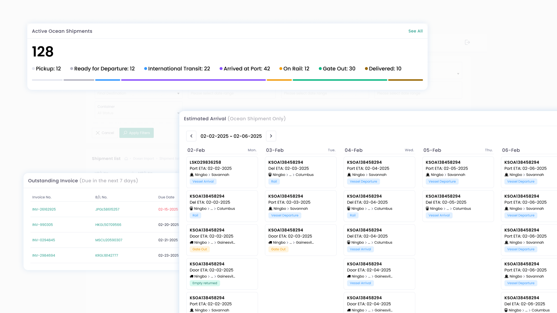
Shipment Dashboard for Importers & Exporters
Freight forwarders use GoFreight to run their operations. The Customer Portal is what they give to their own clients — importers and exporters — to track shipments and manage invoices. Before the Dashboard, those clients had to navigate four separate lists and piece together their own picture.
Designed a Dashboard consolidating Active Shipments by status, an Estimated Arrival weekly calendar, and Outstanding Invoices — based on internal expert interviews and competitive benchmarking
Embedded a Fake Door — a “Customize” button that opened a Hotjar survey — to find out what to build next. 101 users responded. ETA change alerts ranked first across two different question framings.
400
Monthly active users at launch
101
Survey responses via Fake Door
Context
Freight forwarders use GoFreight to run their operations. The Customer Portal is what they give to their own clients — importers and exporters — to track shipments and manage invoices. These end-users aren’t GoFreight’s direct customers. They come in, check what they need, and leave.
Before the Dashboard, they had to navigate four separate lists — ocean export, ocean import, air export, air import — filter each one manually, and piece together their own picture. The information existed; the visibility didn’t.
What informed the design
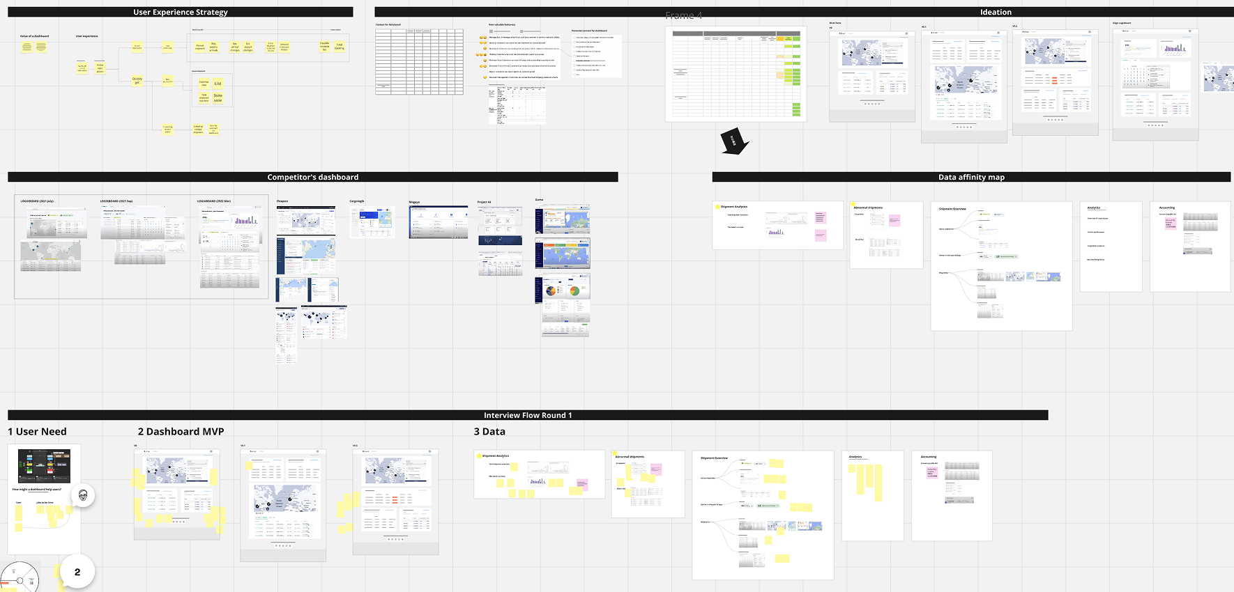
We didn’t start from scratch. Two sources shaped what we built:
Internal expert interviews
Colleagues who had worked in freight forwarding operations before joining GoFreight. They gave us a clear read on what end-users actually monitor day-to-day: shipment counts by status, what’s arriving soon, and which invoices need attention.
Competitive benchmarking
Logixboard and Flexport both had dashboards. Reviewing them helped us identify what was table stakes versus where we could make different choices — and confirmed that dashboards with these three categories made structural sense.
Design decisions
A dashboard is for what you need to know without having to look. If understanding something requires a click — a detail page, a filter — it belongs one level deeper. What belongs on the surface is status, count, and urgency.
That principle drove three decisions:
Decision rationale
Counts over lists
Status counts per stage give users the shape of their shipments at a glance — how many in transit, how many arrived. A scrollable list of individual shipments requires more cognitive effort for the same read.
Weekly calendar, not monthly
What’s arriving this week drives today’s decisions. Monthly view is available, but weekly is the default — the window that actually matters for daily operations.
Invoices at the surface
Invoices due in the next 7 days surface directly on the Dashboard — same urgency window as the calendar. Users can view or pay without navigating into the invoice module.
The Dashboard needed to fit GoFreight’s established portal identity. Our choices — generous whitespace, a consistent card structure, color only where it carries meaning — keep cognitive load low for users who are already managing complexity.
The Fake Door: using the dashboard to find out what to build next
The “Customize Your Dashboard” button in the top right wasn’t a real feature at launch. It was a Fake Door — clicking it opened a Hotjar survey asking users which data they’d want added.
This was intentional. We knew the first version couldn’t include everything. Rather than guessing at the next phase, we used the Dashboard itself as a research surface.
Survey — 3 questions
- Which additional data would you find valuable?
- If you could only add ONE new data point, which would it be?
- Any other information you’d like to share?
101 responses — top result across both questions
16%
Q1: “Which additional data?” — ETA change alerts ranked first
29%
Q2: “If you could only add ONE?” — ETA change alerts again
A consistent signal across two different framings. The open-text responses also surfaced “Entry number” as a recurring request.
The Fake Door cost almost nothing to build and gave us more actionable direction than a dedicated research sprint would have.
What came after
The Dashboard launched to 400 monthly active users. The survey gave us a clear direction for the next iteration — ETA change alerts, entry number visibility.
After launch, the team’s priorities shifted and the second phase wasn’t built. The Hotjar signal is still there. The design work for the remaining modules exists. What’s missing is the org priority to act on it.

Get in touch
Open to the right conversation.
Looking for product design roles
0-to-1 · SaaS · Remote or relocation
Side project collaboration or consulting
Just a curious hello — I read every message